Week 4 SDX placement
15/16th Feb- Over these two days I got to work on making the porotypes and working with the clay. also making 4 texture pieces to see if this would be preferred over a smooth surface. Some photos bellow to show what I was exploring.
After some advice from St-Mango, I was able to bake them without them cracking or being brittle. By putting them at a slightly higher temperature, and baking for 15 minutes. The beads where then strung together with nylon thread.
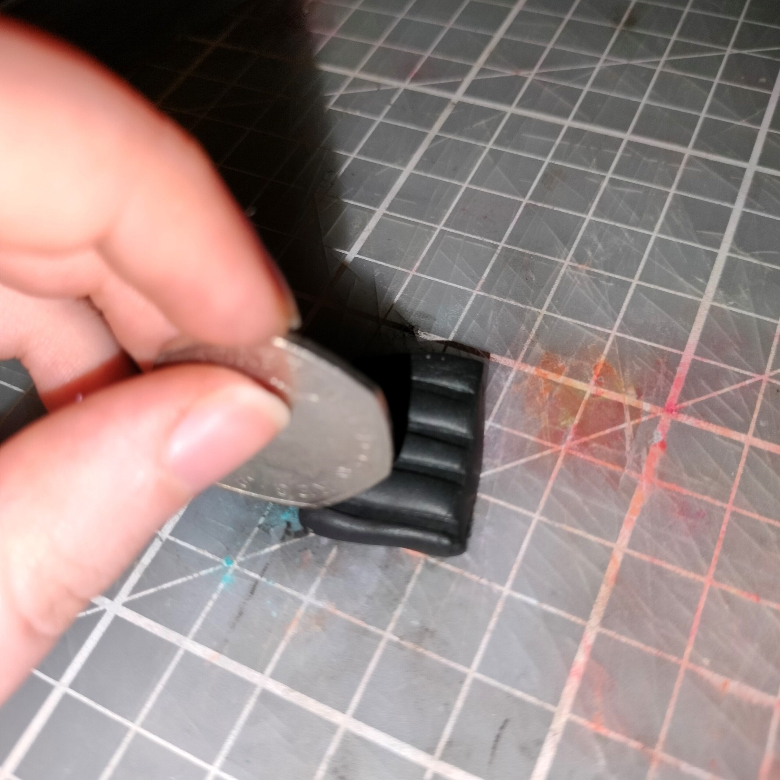
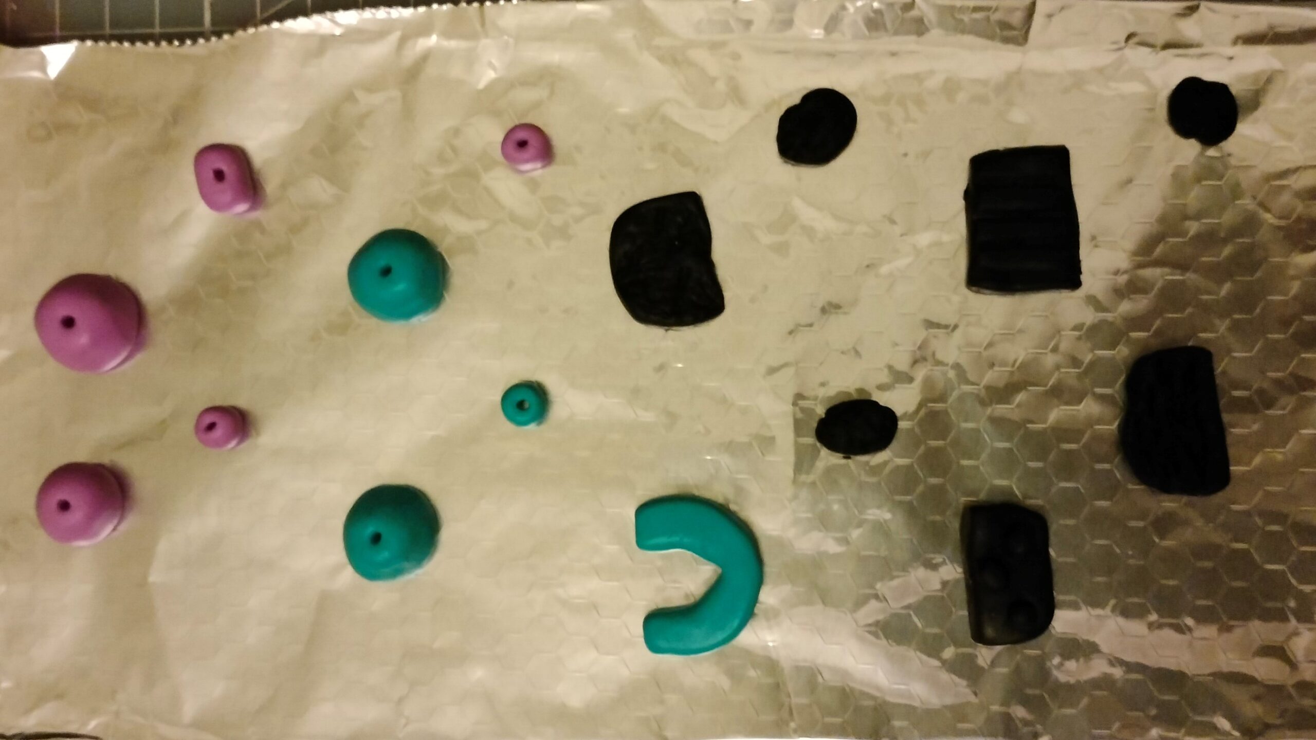
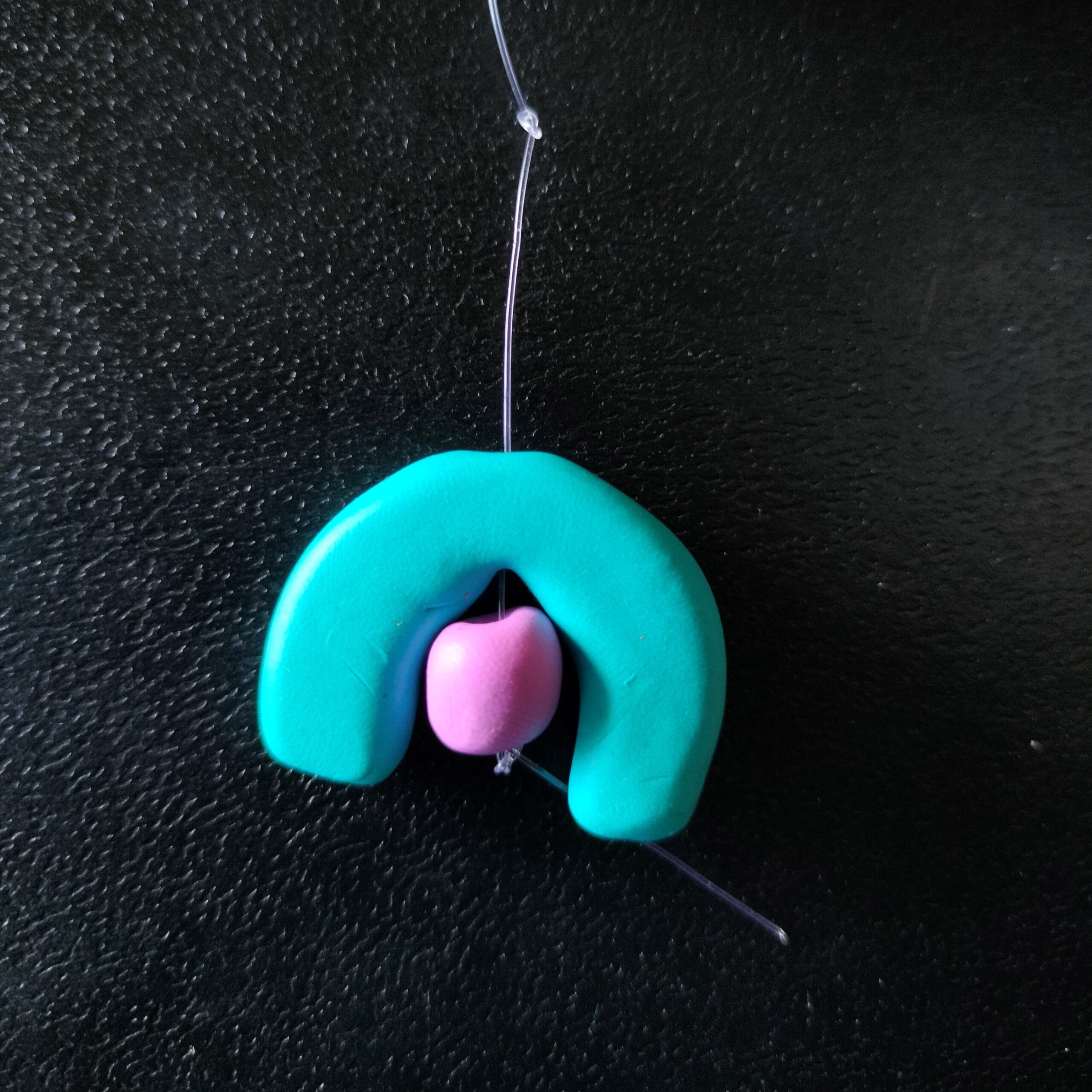
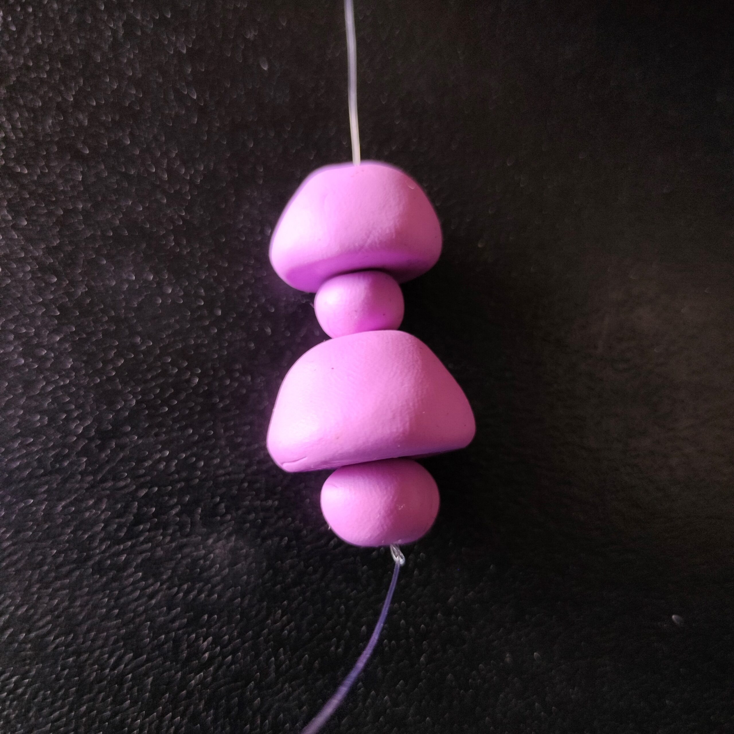
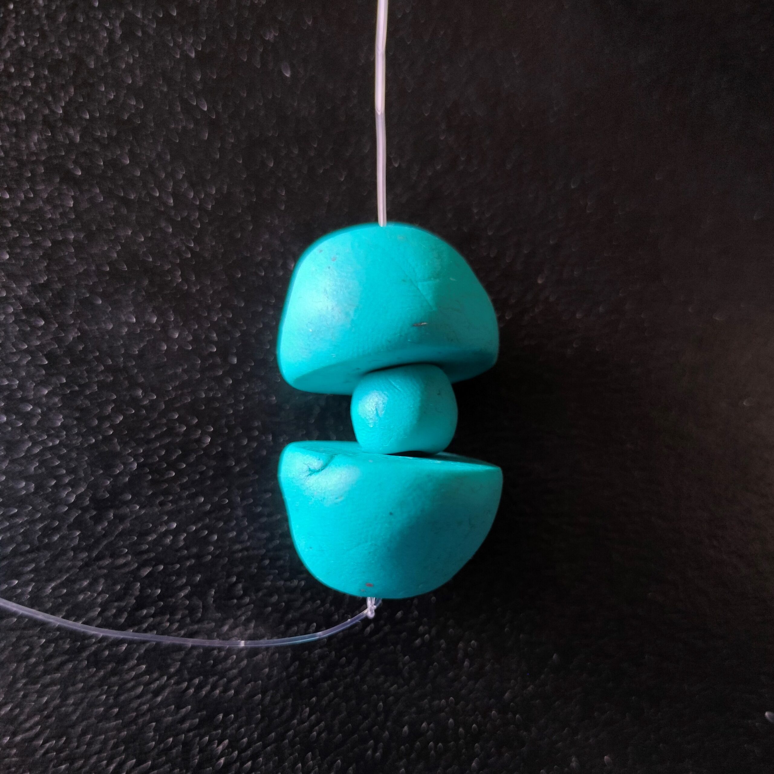
These will be a part of some product testing to see what is the best result for this product. The hand made look is a bit rough so I’ll look into how to refine this and make it look better.
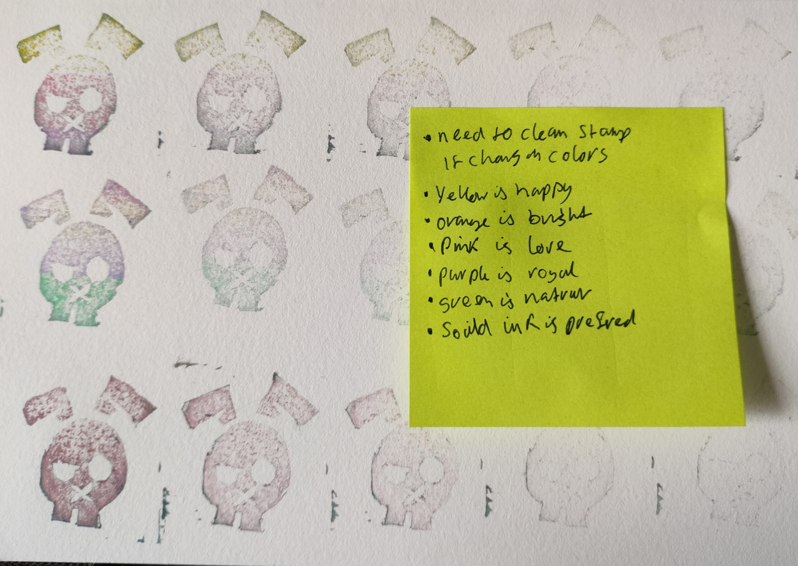
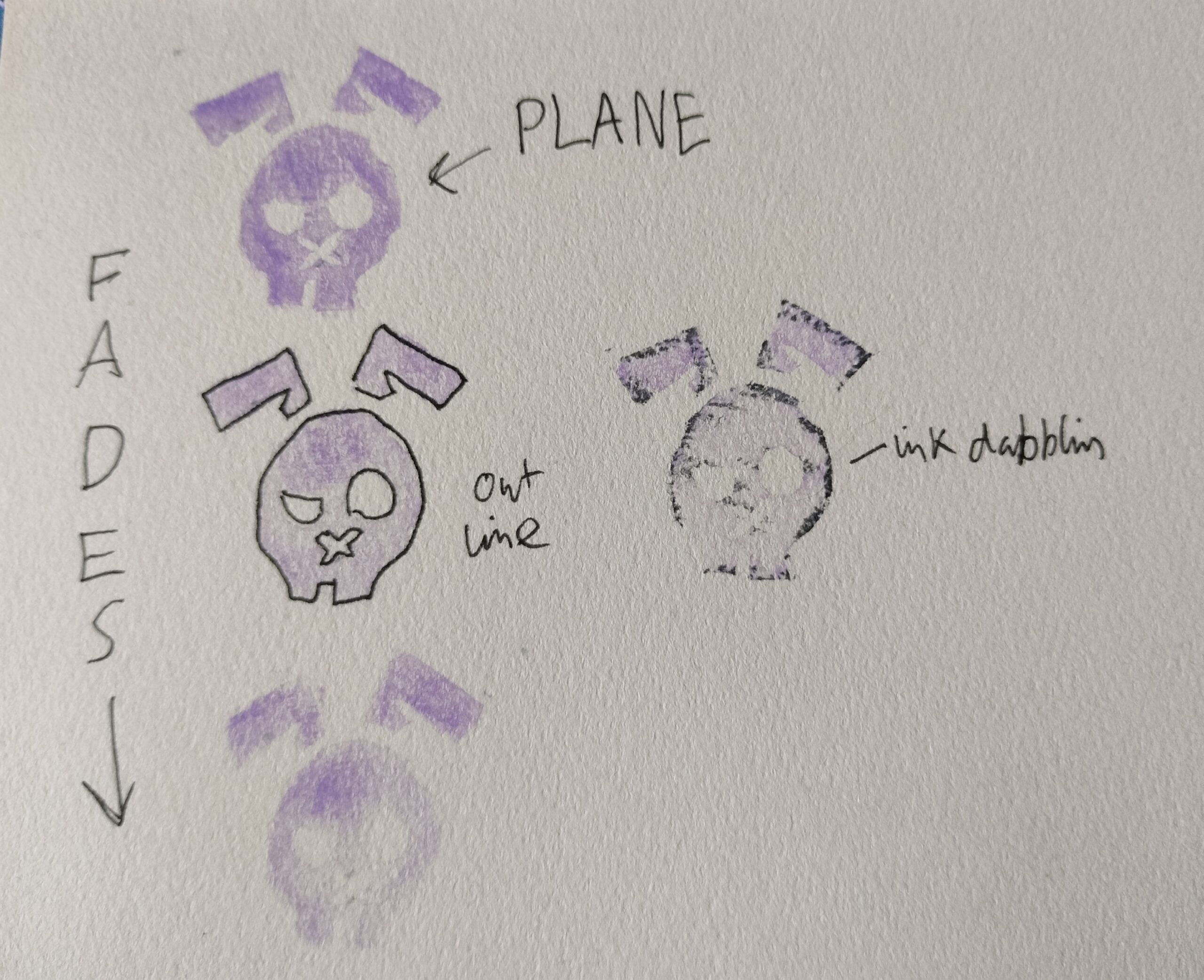
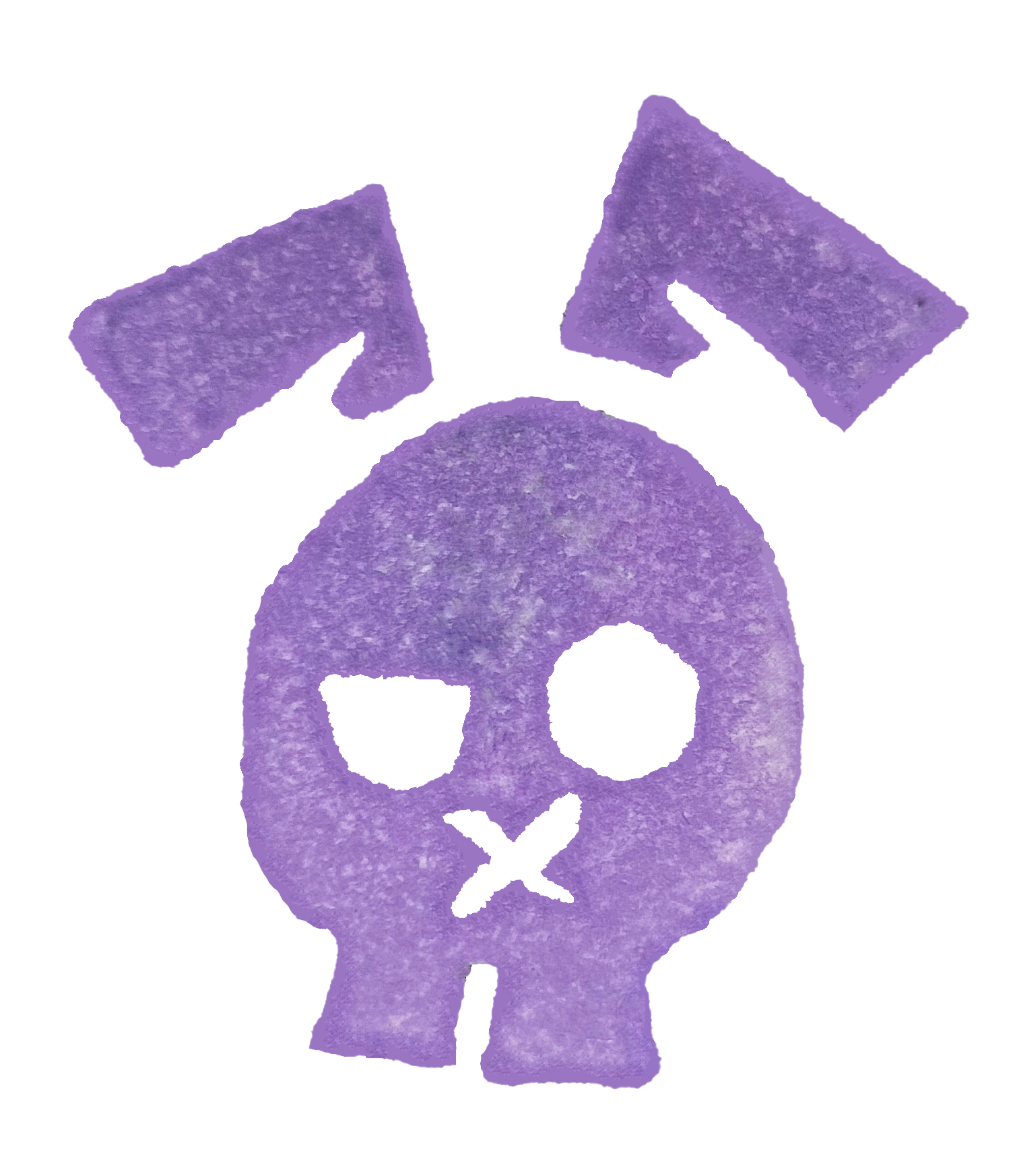
22nd Feb- Looking towards my branding I found it hard to create a brand separate from myself, as I already have an Instagram with a collection of the things I have made in my development as a designer. With a solid logo tied in with the name. RAB__BITS. The Rab part is my initials, and I make bits and bobs. Put together you get rabbits, like the animals. This is what inspired my logo. It went through a development process back in 2019. This product is a bit separate to the work I have done on my Instagram but not enterally different. One way I can keep this logo while making this Necklace its own range is by changing the colour of the logo. I’ve explored this bellow.
The ink isn’t that strong so it is likely I’ll edit the colour in post or use a different ink.
Just a quick look into how many times I can stamp with the ink I have, and if an outline would be beneficial as the purple is a bit lighter than expected. The stamp will help to have consistency across Packaging and business cards, while still giving it a hand made look as the ink never goes down the same way twice.
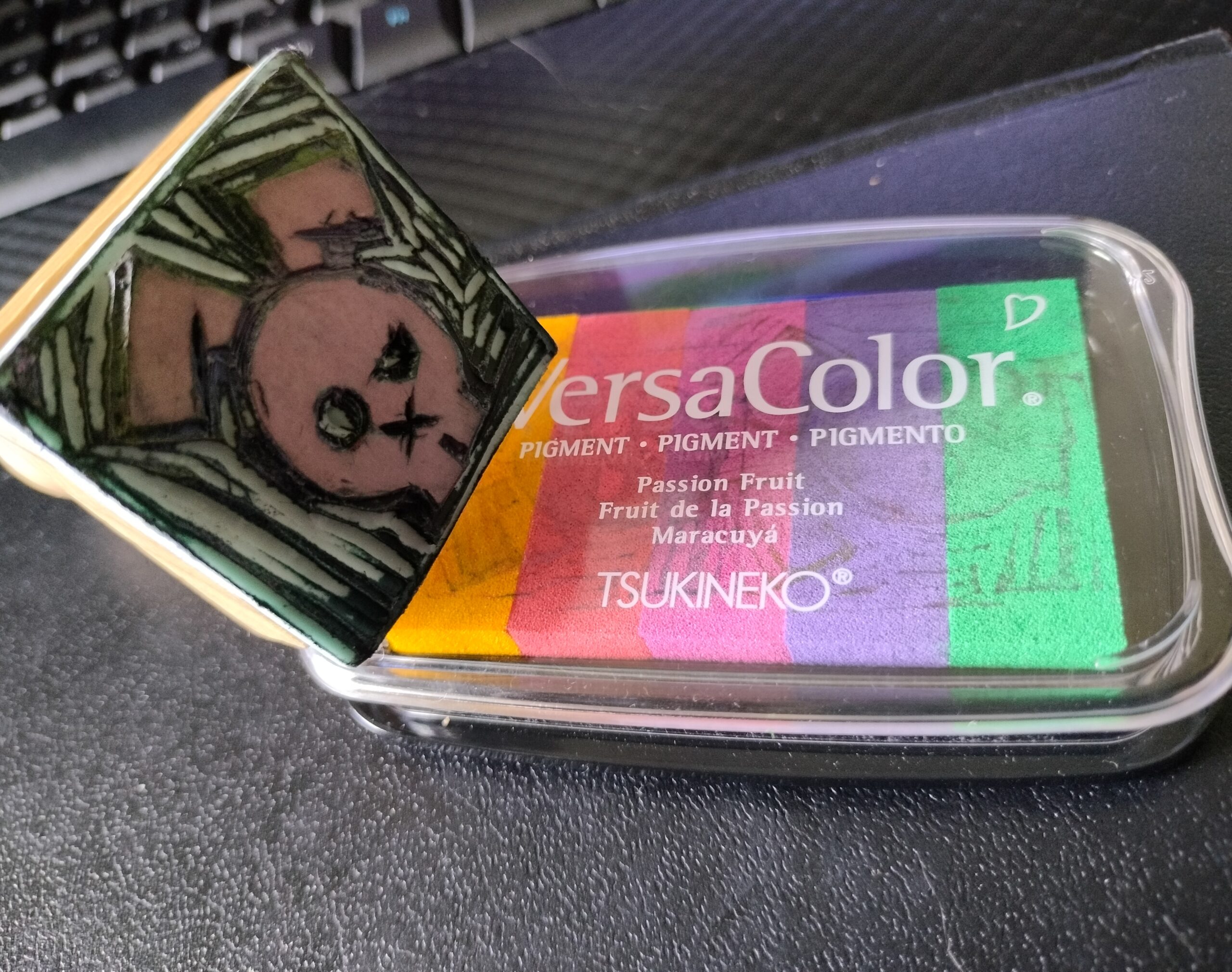
This is the stamp I made back in 2019, along with the ink I had on hand. The stamp will need better cleaned between colour changes if I decide to not just stick with purple for the logo for this range of designs.
Yellow- happiness… But can be overstimulating.
Orange- optimism and energy… But can be overstimulating when bright. But is also the ADHD Awareness colour.
Pink- Playful… ADHD/Autistic safe colour when soft.
Purple- Royalty and luxury… ADHD/Autistic safe colour. Is another colour used to show ADHD Awareness.
Green- Nature… ADHD/Autistic safe colour
Blue- Calm and Trust… ADHD/Autistic safe colour. Is also the Autism Awareness colour.
What am I trying to say with my Logo? So no to yellow and orange as they may be too overstimulating. Pink is often perceived to be feminine, so may avoid to attract more people. Same can be said for Blue, though there is less of a stigma around it. These are not Natural products so to avoid Green washing I shouldn’t use Green. This leaves me with Purple, It will be marketed as a nice product for functions and work spaces. It could be seen as a Luxury item. As well as purple being a soothing colour in its paler lavender form, making it ADHD/Autistic friendly. Picking the right kind of purple will be key, nothing too bold and dark, something more welcoming and light I think would be the best colour choice for this brand range.